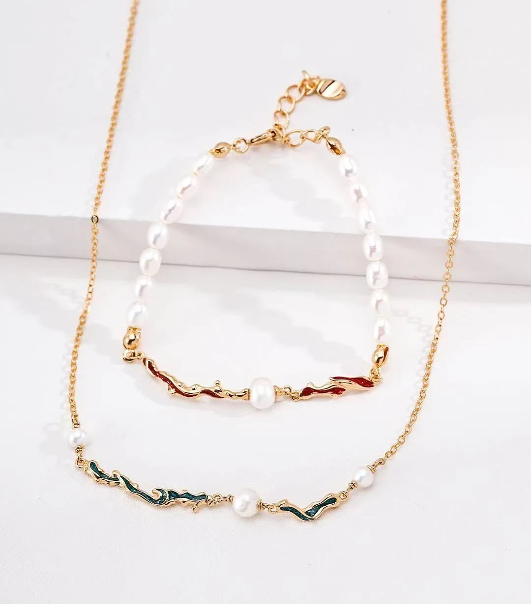
Two rhythms in one piece
A line of pale, pearl-like beads has an even rhythm. Each rounded shape leads to the next, giving the eye a familiar path to follow. The colored curves in this edit interrupt that rhythm in a gentle way. They are longer, less regular, and more playful in outline. The contrast is what makes the necklace and bracelet worth a closer look. Neither element needs to disappear into the other. The beads provide continuity; the curved accents give the arrangement a change of pace.
Give the color some space
A simple top is one way to let these details show. White, cream, and soft gray create a quiet background, while a darker solid color brings out the pale beads. A print can work too, particularly when one of its colors echoes an accent in the jewelry. There is no need for an exact match. Repeating a similar color in a small area can make the combination feel connected without turning every element into a coordinated set.
Wear the pair, or separate it
The necklace and bracelet share a visual language, but that does not mean they have to appear together. Wearing the necklace alone leaves the attention near the face. Choosing only the bracelet makes the color a smaller detail, noticed as the hand moves. Together, they create a repeated motif across the outfit. When deciding between these options, consider what else you are wearing. A patterned sleeve, a watch, or a textured bag may already be providing the extra detail you want.
Look at the spaces between
Color is the first thing to notice, but spacing affects the overall impression just as much. Look at how the curved sections sit among the beads, where the longer elements fall, and how much of the composition remains pale. A necklace with a stronger central accent may read differently from one with color distributed around it. The same is true at the wrist, where a shorter length gathers the details together. These are useful distinctions to consider when choosing a favorite for the monthly edit.
Choose for the way you dress
Rather than trying to build an entirely new wardrobe around a piece, picture it with two or three things you already wear. Consider the neckline, sleeve length, and colors that appear most often. The aim is to see where the jewelry could fit naturally. The photographs here show appearance, not verified material composition; pearl-like is a description of the beads' look. If a piece is listed on Amazon, check that listing for its materials, measurements, and whether items are offered individually or together. A visual pairing should never be taken as a promise of what a purchase includes.